Like many of us, I can suffer from a) chronic overcommitment and b) squirrel brain. What this means is that sometimes you end up committing to something that only sort of fits into your schedule and you also end up going down a rabbit hole that sprawls into places that you didn’t really expect. (you also take almost six months to write up the project, but details.)
This project was also known as:
– four types of paper available
– three types on ink
– three types of lino block
– two colors
– two types of clotheslines
– two styles of clothespins
– one CNC carver module
– two sacrificial dish scrubs from our sink
– one agonizing last-minute order of a press that needed to arrive the day before I ordered it
Way more ideas.
As soon as Craven won Crown (his seventh!) for Elzbieta, I pretty much messaged Elinor and asked ‘want to do their sigils/cyphers?’ and mercifully, she was game. We had been talking printing for some time, occasionally sending things back and forth, and had been thinking about something.
Kingdom Signet was good with it. Crown was good with it (even as I totally jumped the gun on asking/planning and started before they stepped up… and so we sat on the project for a few months and sort of started to hash out designs.
Now, woodblock printing is very solidly in-period. Not to mention there’s been quite a bit of interest in printing in the SCA lately – though probably more notably on fabric than on paper. However, for all that I will happily state that I have a tendency to dive head first into things, I’m not quite as utterly reckless as the motto (‘How Hard Can It Be?’) may appear. I’m also fairly sure of when I need to step back, and go in stages, which was what I needed to do here.
For this particular experience, I was joined by my partner in crime, Elinor (von Holtzclaw). Really, without her it would have been a complete and utter failure.
We’ll start at the beginning here. The proposal was printed scrolls, with most of the text (originally all except names and signatures) already on them. I’ve known enough scribes to know that sigils and cyphers are a lot of work, and the less writing on them, the better. And so began what I think turns out some of the best work, when you let something mull in the back of your mind, and where you just let that project grow. You need to think about the ideas, and let them grow to be the project they were meant to be.
This is an attempt at a prosaic way of saying ‘and then we sat on the project until about half-way through the reign, occasionally shooting ideas back and forth.’
Really, what we did was spend the time doing less art, and more on research and playing around. Wood, though a lovely idea and honestly something that we’d love to try, wasn’t going to be feasible – neither of us are quite up to par to do that work yet. However, we’d been spending time researching, and both of us have what could perhaps be argued are more fine-art tendencies when it comes to projects, and so we turned to modern tools.
It helped, certainly, that I’d bought a number of art supplies for printing previously – having done printed scrolls and also for some tests we’d done of cutting blocks out using the Snapmaker. I also had a few types of ink, brayers, and some speciality supplies I’d bought because my limited experiences had indicated that I endlessly preferred oil-based ink to acrylic. (Meaning I had magnesium carbonate and burnt plate oil, plus mineral spirits.) From previous experience, I knew a few things were going to end up being a bit of a pain, and while I contemplated doing them on pergamena, I’d done scrolls on perg and the slick surface that’s great for scrolls makes printmaking a headache. (NB: we probably could have roughed things up a bit and the ink would take better, but there are times when experimental isn’t the way to go.)
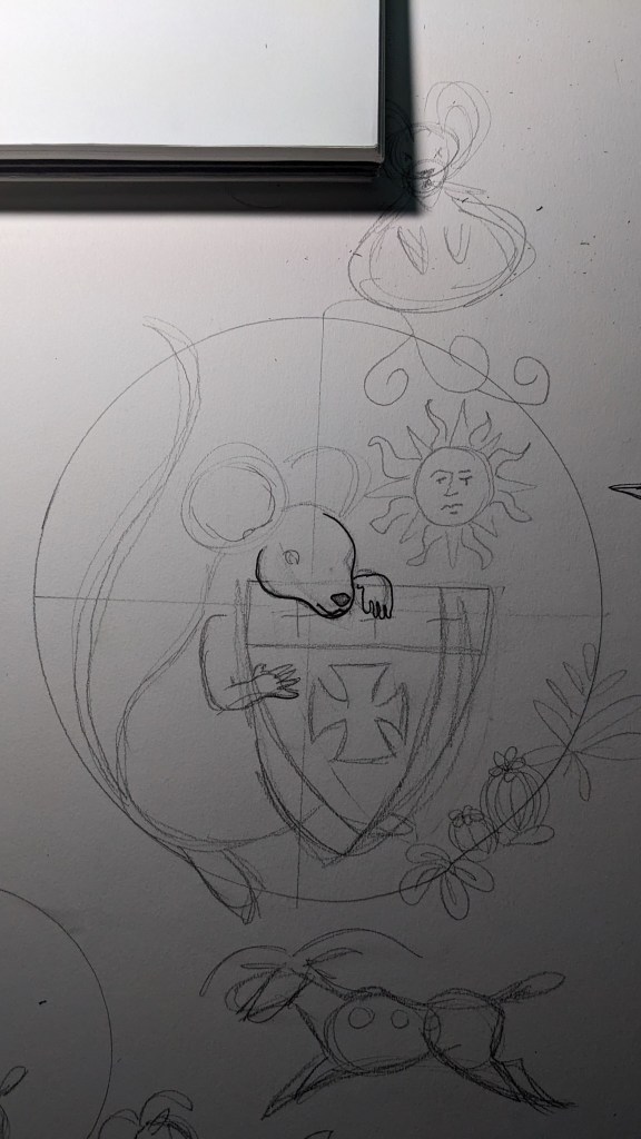
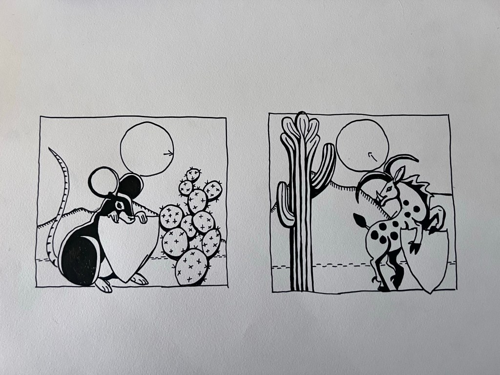
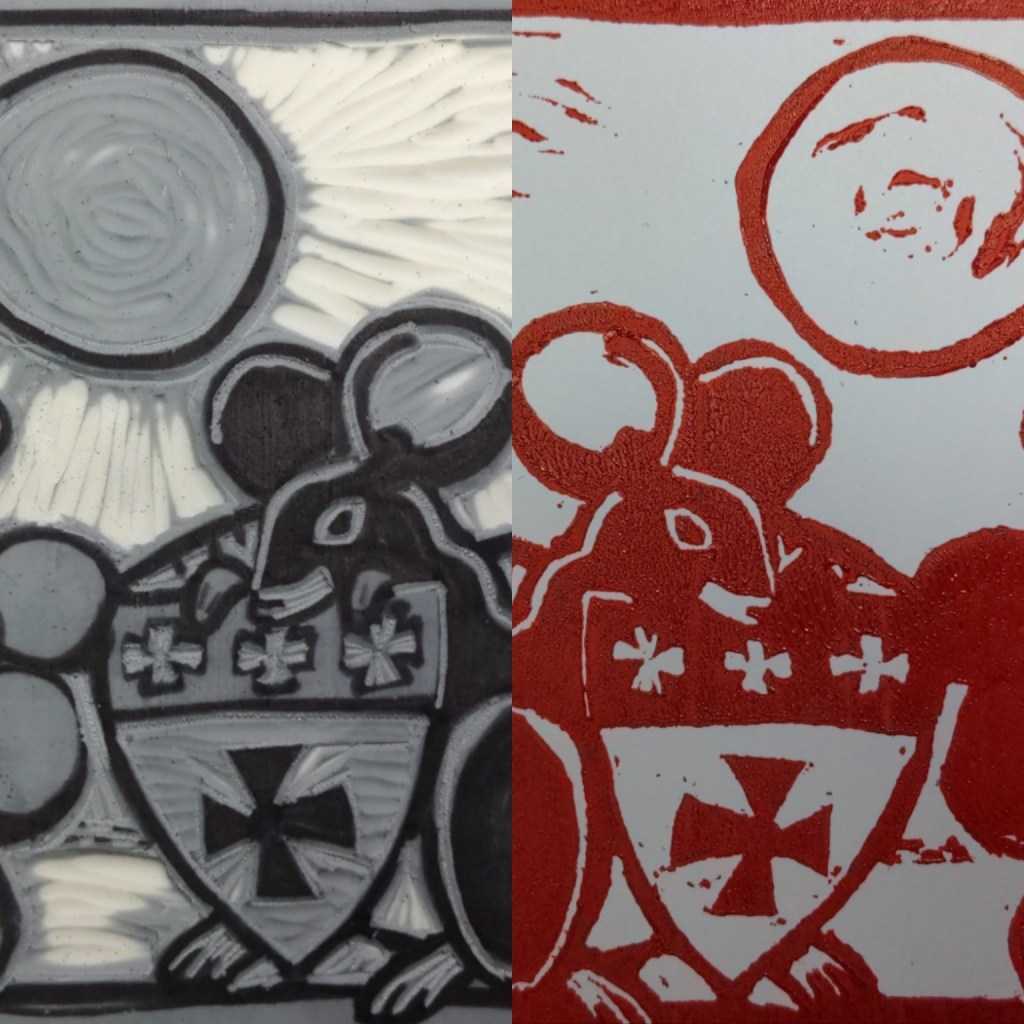
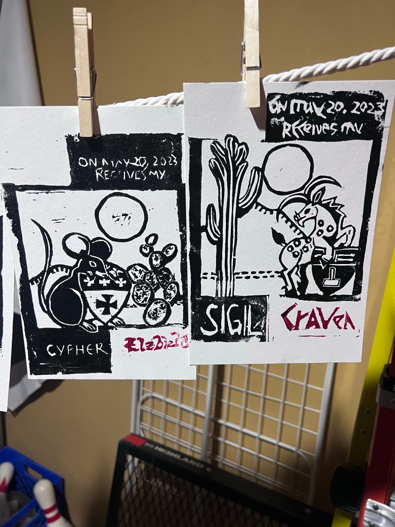
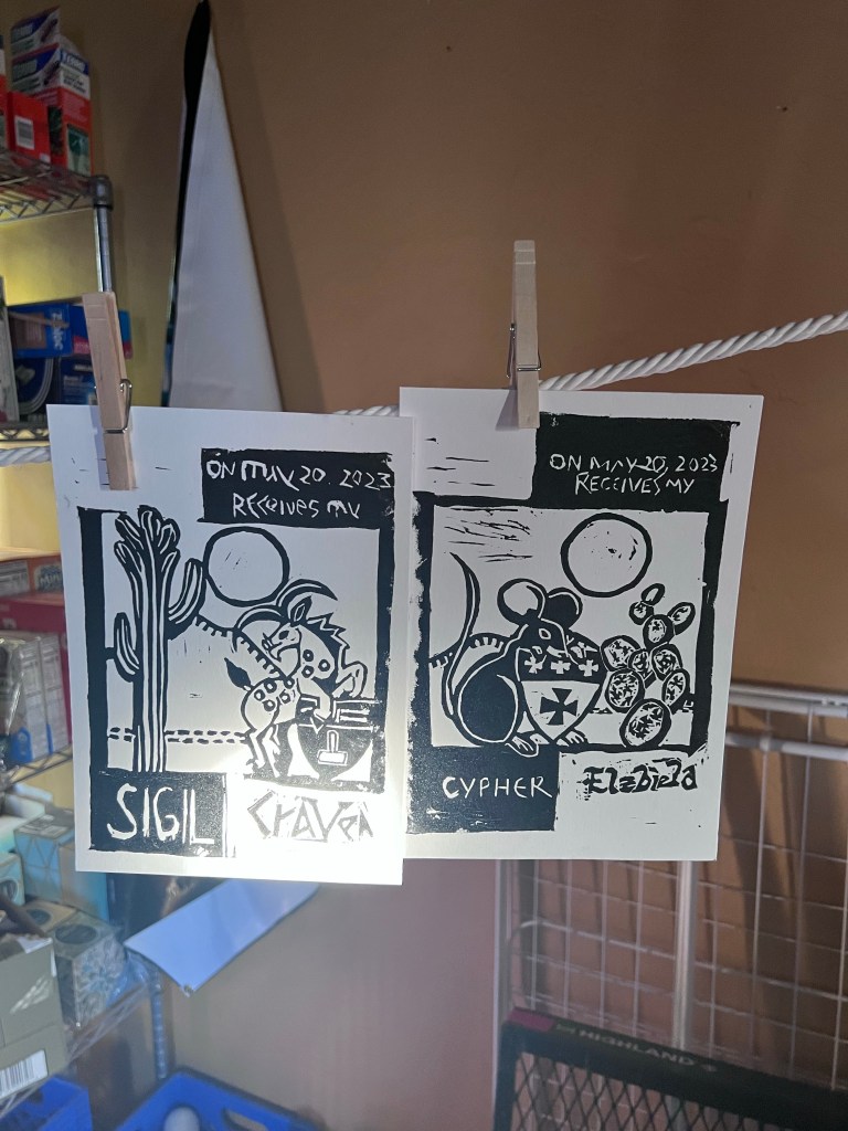
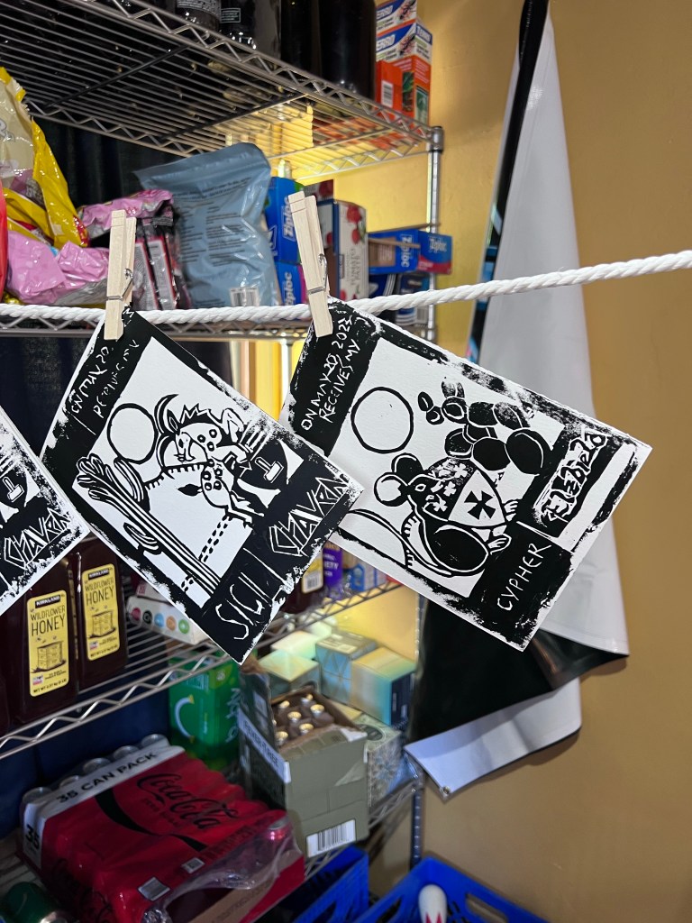
Elinor and I had been bouncing ideas back and forth, and we knew a few things were going to be important here – simple design, and print as much as possible. She’d also been doodling mice, and we found that we kept going back to them, They were playful and cute, and Her Majesty Elzbieta has them on a number of things. To keep with a theme, I spoke with His Majesty Craven about what animal he’d like, and he wanted a yale beast. (This meant that I ended up explaining what a yale beast was many, many, times to family and friends interested in what we were working on.) The inital sketches were more complex then what we settled on – but I figured that if we had something complex, we could always simplify it. This proved to be a very, very, good plan. Considering we’d also pitched this as ‘less scroll, more art’, we had some leeway to play around with design, layout, and general aesthetic.
I should note here – originally, we had planned to use the Snapmaker’s CNC module to cut the scroll text/design. There were reasons for this – I’m on a kick about blending historical with modern, and also it would be nice to just put it in the jig and let it run. However, for several reasons that ended in a broken bit and just pushing on we decided to do it by hand. While this is not something regretted at all… it’s also did mean that we needed to make some adjustments.Including confirm that, in fact, I could carve text.


Mercifully, I could.
Now that we knew the elements were possible, it was time to actually put them together. We had quite a bit of back and forth before deciding on the design – as little text as we could manage, animal, shield, and something desert-y. We also realized we had a small problem, in that neither of us were quite the best in terms of shading, and so we enlisted the help of the gracious and amazing THL Ponar’ia Apoloseva. Who was more than happy to assist and knocked out what we needed in a criminally quick amount of time.
Have I mentioned recently how absolutely awesome she is?
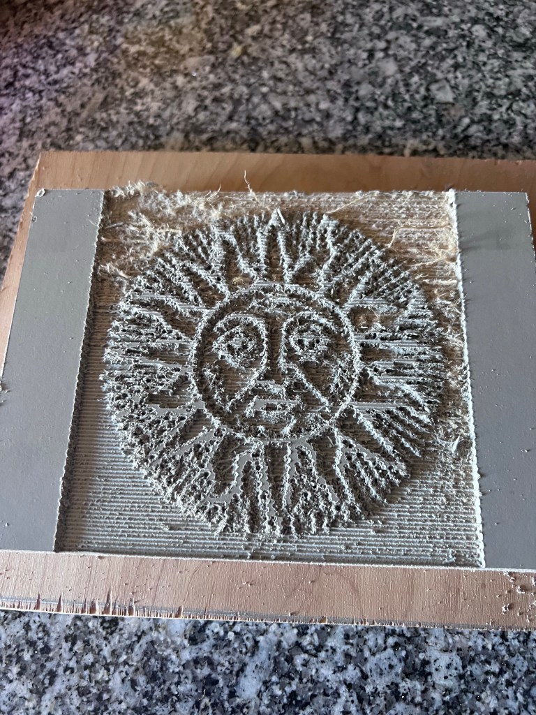
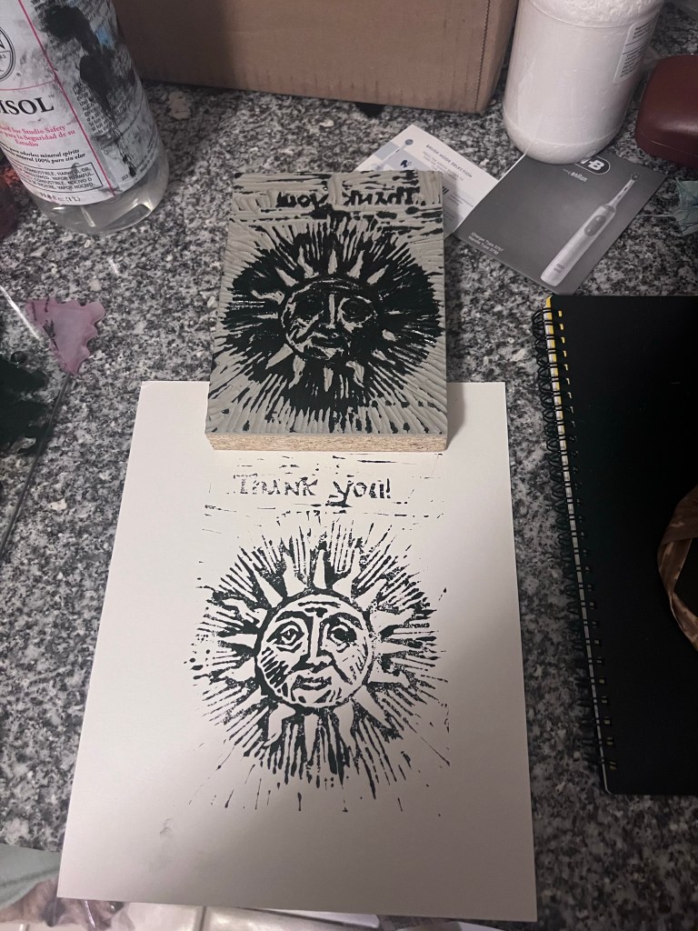
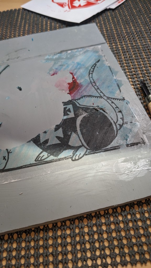
Once we had the design, the task at hand was overall straight forward. It was a matter of transferring the image to the block, then carving.
Text was kept very deliberately simple, though earlier plans had it more complex. We got images of the Crown’s signatures, and used them and several print outs to layout the design of the text so that it would be easy to transfer. I created a very basic image using the Mac’s Preview software, and then played around with sizing and levels until we got a clear black and white version that could be printed on our laserjet printer. Were this to be done again, would likely end up using a more powerful software for the layout, but that’s a matter of personal choice. I likely would also do a better version of the text, making it look more appealing instead of the semi-modern aesthetic that the project ended up leaning towards. I think that a harder block would allow for greater detail.
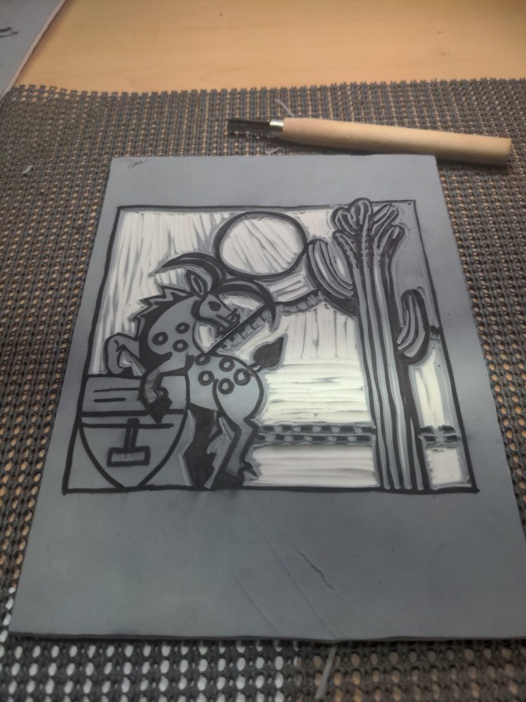
To save you the arduous description of how we ended up settling on a block, I’ll leave it at the fact we ended up using the Readycut lino block from Blick, and to transfer we printed on a laser printer, then followed the PVA glue transfer method described in this blog post. It’s worth noting at this point that if we were to do this again, changes would be made. Most likely a different block type and we’d try a few more methods to transfer the image. While the PVA glue worked, in cleaning it up we found that we ran the risk of removing all of the ink from the block, which resulted in time spent with a sharpie very carefully redoing lines. Later tests with other block types seemed to work better, so it’s something to consider.
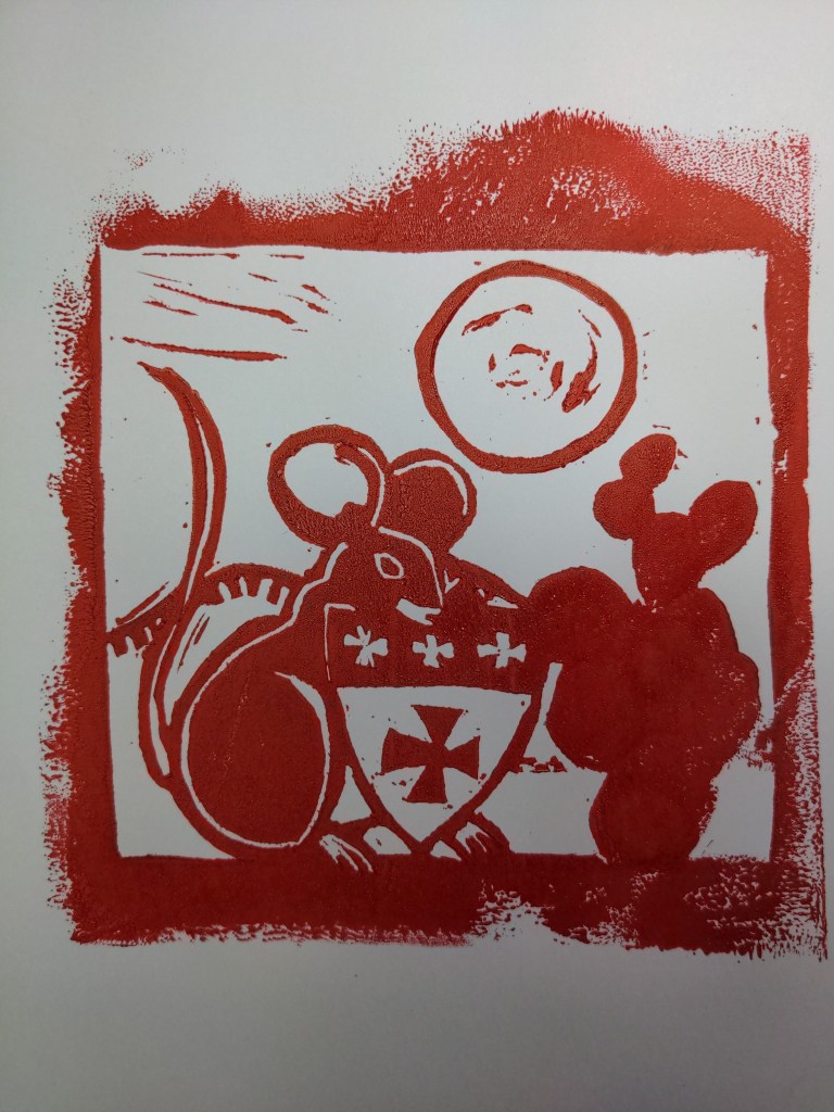
The actual printing was, in some ways, the easiest part. During some tests, we realized that getting a press wasn’t so much something that would be nice, but in fact, a necessity. Frantic research (including how fast it could get here) led us to a small press by Woodzilla, and it was easily the best thing that we ended up purchasing for this. While use of a baren was doable, and we got some excellent prints with it, the number that we were making and the time frame (they needed a week to dry – more on that in a minute) meant that being able to do this quickly, and with the least amount of hand stress, was the way to go.
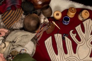
For the printing materials, we went with traditional and professional quality. I’d printed on perg many years ago, and was not about to do it again – especially because we were going to use oil-based inks. Speedball acrylic would have done the job just fine, but I much prefer Gamblin’s professional etching inks. While they dry much, much, slower (we gave them about a week) I find that the control is better and the print is more even. The evenness of the print was also helped by deciding to use a thick paper intended for printmaking. Perg is a lovely surface for many SCA uses, and I’m definitely a fan of it for quite a few applications. However, paper is definitely period (albeit for for certain cultures, and since this didn’t have a specific one… it wasn’t a concern) and using a material meant for the purpose worked much better than not.
As mentioned above, the biggest downside to an oil-based ink is the drying time. Mercifully, we’ve got an Arizona Room (an uninsulated room with lots of space to spread out) and were able to run clotheslines across it to hang the prints. The initial clothespins – wooden – and line – a thin nylon rope – left dimples and didn’t hold nearly as well as we were hoping (you needed several pins and they weren’t sturdy), so we ended up with a very thin line intended for hangers and very thin metal pins. This ended up working quite well, even if it meant getting to the pantry shelves behind them could be a bit of a challenge. I spent alot of time ducking to get around them so that there weren’t any smudges.
We anticipated a week to dry, and checked daily to see how tacky the images were. Probably another day or two would have been ideal, but schedules and deliveries needing to be what they were, a week was a good time. Having decided to print Their Majesties signatures was a definite bonus, because it meant that only the recipient names needed to be added to the scrolls, a fact that definitely made the Kingdom Signet very pleased.
Overall, this was a project that we were pleased with, despite the flaws and stumbling blocks that may have occurred here and there. It’s one that I wouldn’t mind revisiting down the line, having learned quite a bit from it. (Not to mention, I now have the appropriate supplies for further versions, so the upfront cost will be much less. I’m aware that it could have been done much cheaper, but I’m a bit of a stickler for the right tools for the job at this point in my life, so I definitely made sure that I had those.)
I have no doubt that this will not be the last set of prints that get done – as we set up the shop there a dedicated space for printmaking being set aside. We’ll certainly see where things go from here!
